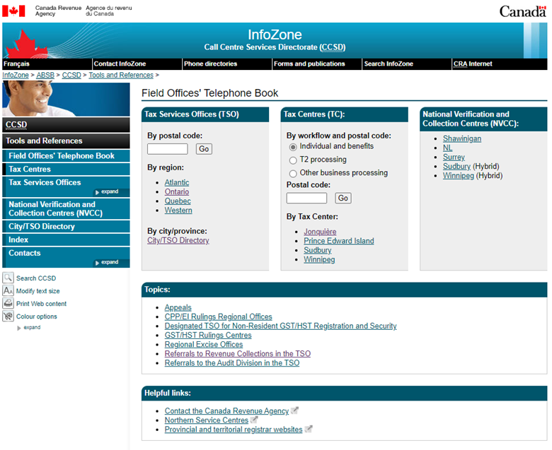
The Field Office Telephone Book
(FOTB)

The Field Office Telephone Book (FOTB) is an internal site used by CRA call centre agents to look up mailbox and taxpayer-related contact information across Canada.
PROJECT SCOPE
Role: UX Research & Design
Contribution and Method: Recruitment, Surveys, Usability Testing, Facilitating, Low & Medium Fidelity Prototypes, Report Writing
Timeline: 1 year and 7 months, 2022-2024
Client: Canada Revenue Agency
Tools: Figma, MySurvey, Teams
Project Overview
CLIENT KICK OFF
Director of my Branch at CRA, Kira Sherry, wanted the redesign the FOBT internal site to help center agents in the Canada Revenue Agency to look up nationwide mailbox and taxpayer contact information.
OBJECTIVES
Redesign the FOTB so agents can quickly and confidently find accurate information without unnecessary clicks or delays.
Improve the experience of the current cell center agents looking up mailbox information in live calls
Reduce the number of times call center agents refer to their team leads, and resource officers reduce call times and reduce look up information time
PROBLEM
Crowded layout: Small text boxes and cluttered information made navigation difficult.
Inconsistent structure: Different sections had varying formats, forcing agents to rely on memory.
Search limitations: Postal code search was sometimes inaccurate; other navigation options lacked clarity.
Steep Learning curve: Newer agents struggled to find key information quickly. Agents often relied on team leads and resource officers instead of the tool itself, increasing call handling times.


Methodology
Kick off Meeting ⇢ Survey Design ⇢ Analysis ⇢ Ideation and Medium Fidelity Prototype ⇢ Usability Testing Round 1 and Analysis ⇢ Iterative Medium Fidelity Prototyping ⇢ User Testing Round 2 and Analysis ⇢ High Fidelity Designs ⇢ Final Report
SURVEY
To acquire the information to begin the Field Offices’ Telephone Book (FOTB) survey was conducted to examine the current status of the site, to determine how agents felt toward the site, and if they had any feedback to improve their experience. This survey was released with the purpose of evaluating the highest areas of traffic on the site, the preferred methods of use, and overall experience and main issues of concern for participants.
Participants: 109 CRA agents from various regions
Goal: Identify how often FOTB is used, common tasks, pain points, and improvement suggestions
Key Findings:
48% use it primarily for fax/mailing information
79% eventually find what they need, but 68% still see room for improvement
77% never use the Cities/TSO directory
Most want clearer navigation, more intuitive search, and consistent formatting

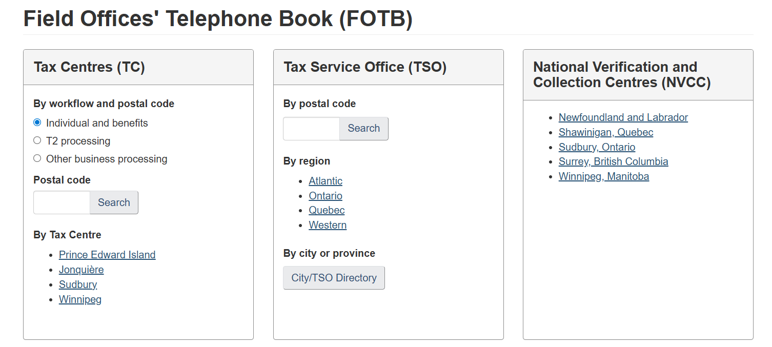
MEDIUM FIDELITY PROTOYPE
The recommendations that I collected were the foundations of the steps I used to begin with a medium fidelity mock-up, using Figma. With this large of a test group I believe that the response towards the FOTB is strong enough and clear enough to begin offering preliminary solutions.
Updating the current layout so that it is clearer and more linear, instead of using tables within the directory there could be a pop up function so that all the information is in one designated area and wouldn’t be crowded by other departments
Adding a map function to the postal search as a few participants mentioned that the search isn’t always correct. Advancing the search function would ensure that they don’t need to spend extra time confirming the accuracy
Placing icons for the phone numbers in order to identity internal or external, and for which department the fax numbers fall under
Offering a postal code search for the NVCC, and keeping the main fax numbers for NVCC on the right or in a clearer placement to see the numbers
Keeping a consistent format throughout the pages, and allowing for more ease of use. Keeping a logical structure so that agents can intuitively find what they’re looking for instead of relying on memory

DESIGN RECOMMENDATIONS
Clearer layout: Replace tables with pop-ups or dedicated sections
to reduce clutter.
Enhanced search: Improve postal code accuracy; add map view
and city/province context.
Visual cues: Use icons to indicate internal vs. external phone numbers,
and department type.
Consistent formatting: Apply a logical, predictable structure across
all pages.
Highlight high-use tools: Place most-used numbers (e.g., NVCC fax) in
persistent, easy-to-find locations.
Categorized navigation: Organize links in “Topics” and “Helpful Links” by
subject for faster scanning.

USABILITY TESTING
Format: 2 rounds, 12 participants, 1-hour moderated sessions
Tasks: Based on real call scenarios (e.g., finding mailing addresses, NVCC info, referral numbers)
Results:
Overall task success rate: 89%
Confusion often stemmed from unclear labels, lack of geographical context, and hidden instructions
Agents preferred direct search options over browsing by index or directory
KEY INSIGHTS
Information is findable, but the process is not always intuitive.
Search accuracy and contextual clues (e.g., province names, department icons) are essential.
Agents want one central place to find contact details without clicking through multiple links.
Certain high-traffic functions (e.g., fax/mailing info, NVCC lookups) should be prioritized in the layout.

Impact
By centering the redesign on agent feedback and usability testing, the updated FOTB will:
Reduce call handling times
Lower reliance on team leads for contact information
Shorten onboarding time for new agents
Provide a consistent, modern, and user-friendly experience
Thank you for reading!
