Email Link Management System
(elms)
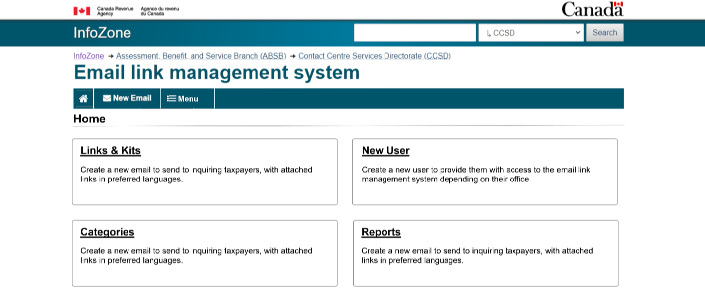
Project Overview
The Email Link Management System (ELMS) is used by CRA contact centre agents to send taxpayers curated resources, forms, and publications by email. The system plays a key role in efficiency, accuracy, and overall taxpayer experience. This case study documents the UX research and redesign process aimed at improving ELMS usability, streamlining workflows, and ensuring agents can complete tasks with clarity and confidence
PROJECT SCOPE
Role: UX Research & Design Lead
Client: Canada Revenue Agency (CRA)
Timeline: Multi-phase project, 2023–2024
Methodology: Cognitive walkthroughs, heuristic evaluations, prototyping, usability testing
Tools: Axure. Teams, MySurvey, Optimal Workshop
KICKOFF
At the project kickoff, stakeholders identified the following objectives:
Understand the main usability issues agents face with ELMS
Redesign the interface to simplify workflows and reduce errors
Increase user satisfaction and task success rates
Reduce task time for common actions (adding kits, editing links, sending emails)
Ensure the redesign aligns with accessibility and WET 4.0 standards
OBJECTIVES
Success Metrics (KPIs):
Increased task completion rate
Reduced time on task
Higher user satisfaction scores
Fewer reported errors
Problem
Agents reported the current ELMS as cluttered, confusing, and inconsistent. Common issues included:
Overuse of unclear icons instead of descriptive text
Hidden or hard-to-find buttons (e.g., “Add kit”)
No undo or confirmation options for critical actions (e.g., link deletion)
Error messages displayed in code instead of plain language
Inefficient screen layouts with wasted space and redundant steps
These issues led to task delays, errors, and frustration, impacting both agents and taxpayers.
Solution
Redesign ELMS to:
Use clear, consistent labels and icons
Improve navigation and search functionality
Provide feedback and error prevention features
Optimize layouts to reduce clutter and wasted space
Support accessibility and bilingual requirements
Create an intuitive flow for sending taxpayer emails


Methodology
Kickoff & requirements gathering ⇢ Heuristic evaluation of current ELMS ⇢ Medium-fidelity prototypes (A & B) designed with WET 4.0 standards ⇢ Cognitive walkthroughs and usability testing with agents ⇢ Iterations based on feedback and insights ⇢ Recommendations shared with stakeholders in a professional report.
1. Heuristic Evaluation
Conducted by UX experts against Nielsen Norman’s 10 usability heuristics
Identified 33 usability issues:
6 Critical (e.g., link deletion without undo, styling breaking text fields)
11 Major (e.g., unclear error messages, redundant steps)
16 Minor/Insights (e.g., small design inconsistencies, button placement)
2. Cognitive Walkthrough (Usability Study)
7 agents participated in walkthroughs of two medium-fidelity prototypes (A & B)
using Axure
Agents completed real-world tasks such as:
Adding/removing links and kits
Searching and filtering resources
Previewing and sending emails
Feedback was gathered on ease of navigation, layout clarity, and error handling
Forms & Publications Page
Creating a Form
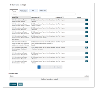
Prototype A
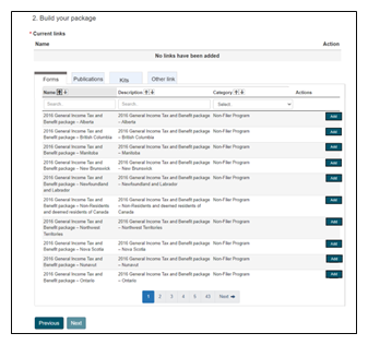
Prototype B
3. Task-Based Usability Testing
Prototyping
Two prototypes tested (A & B) using Axure
Iterations focused on:
Labeling icons with text
Adding preview functions for kits and links
Improving error messages and confirmation dialogs
Reordering language options for clarity
Streamlining redundant steps
Facilitating
Simulated scenarios (e.g., “Send the Fuel Charge kit to a taxpayer”)
Collected observations on task flow, confusion points, and success rate
Gathered recommendations directly from agents
Forms & Publications Page
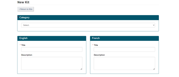
Creating a Kit

Prototype A
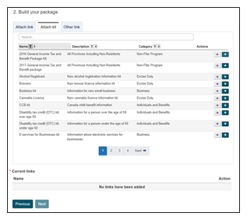
Prototype b

Key Insights
Prototype A was preferred due to better search tools and layout
Agents valued step-by-step flows that minimized scrolling
Search bars and category filters were consistently favored
Some icons (e.g., “+” for add, “eye” for preview) were unclear to several participants
Agents wanted more control (e.g., preview before attaching, undo for deletions, add individual links from kits)
Error feedback needed to be clear, immediate, and in plain language
Recommendations
Replace icons with text-labeled buttons (e.g., “Add Kit” instead of “+”)
Add undo/confirmation dialogs for deletions
Introduce preview options for links and kits before attaching
Improve error messages: plain language, visible next to the field
Reorganize layouts to reduce wasted space and scrolling
Provide ability to add individual links from a kit
Standardize button placement across pages

Impact
Agents found redesigned prototypes cleaner, less overwhelming, and more intuitive
Tasks (adding kits, removing links, previewing resources) were completed with higher success and reduced confusion
Improved design addressed critical usability issues, reducing risk of task failure and errors
The redesign supports CRA’s broader goals of efficiency, accessibility, and user satisfaction
Next Steps
Implement recommended design changes in development phase
Conduct additional usability testing on high-fidelity prototype
Monitor performance using KPIs (task success, task time, satisfaction scores)
Plan for long-term enhancements (mass delete, more flexible reporting tools)
Provide ongoing user training and support documentation
Thank you for reading!
